Monday 28 November 2016
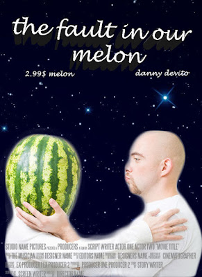
mfovie poster
Tuesday 22 November 2016
Photos
Rule of Thirds
This represents rule of thirds because as you can see Matthew is right along the points.
Fill the Frame
This is a good example because he is close to the camera and fills most of the frame.
Framing
This is a good example of framing because he is in the frame made by the diamond shaped fence.
Intentional Blur:
In this one, he is creating an intentional blur by dabbing.
Zoom Blur:
I couldn't quite capture the effect but this photo was taken while zooming into his face.
Selective Focus:
As you can see the photo is focused on Matthew and not Yuri.
Panning:
I took this photo while panning while Matthew was running past the camera.
Leading Lines:
I made the photo black and white, and then used the burn tool to make the cracks in the road stand out more. I also made the 23 on his shoes red.
Pattern:
This shows the pattern inside the shipping containers by the field.
PORTRAITS:
NO REFLECTOR
I like the way he's not looking at the camera, as it makes it seem more natural, like a camera wasn't there. The lighting was nice on this portion of the brick wall behind him, and I managed to expose it just right.
NO REFLECTOR
I like his jacket and the way it contrasts against the red brick background. He resembles the average working man, and once again he's not looking at the camera, so it looks more natural. I wish I could have straightened the background a bit more.
Thursday 10 November 2016
Composition
Rule of Thirds:
I picked this photo because it has a nice composition and demonstrates the rule of thirds nicely. It is spot on with the intersects.
I picked this photo because it has a nice composition and demonstrates the rule of thirds nicely. It is spot on with the intersects.
Leading Lines:
I picked this picture for leading lines because it has many different examples on how they lead to the girl walking.
Fill the Frame:
I chose this photo because it shows that a good example and includes a common idea for photos; dogs.
Framing:
I chose this picture because it uses something that wasn't meant to be used as a frame, in this case a fence, and it includes a recognizable monument.
Subscribe to:
Posts (Atom)


